
Why Your Website Isn’t Converting (and What to Do About It)
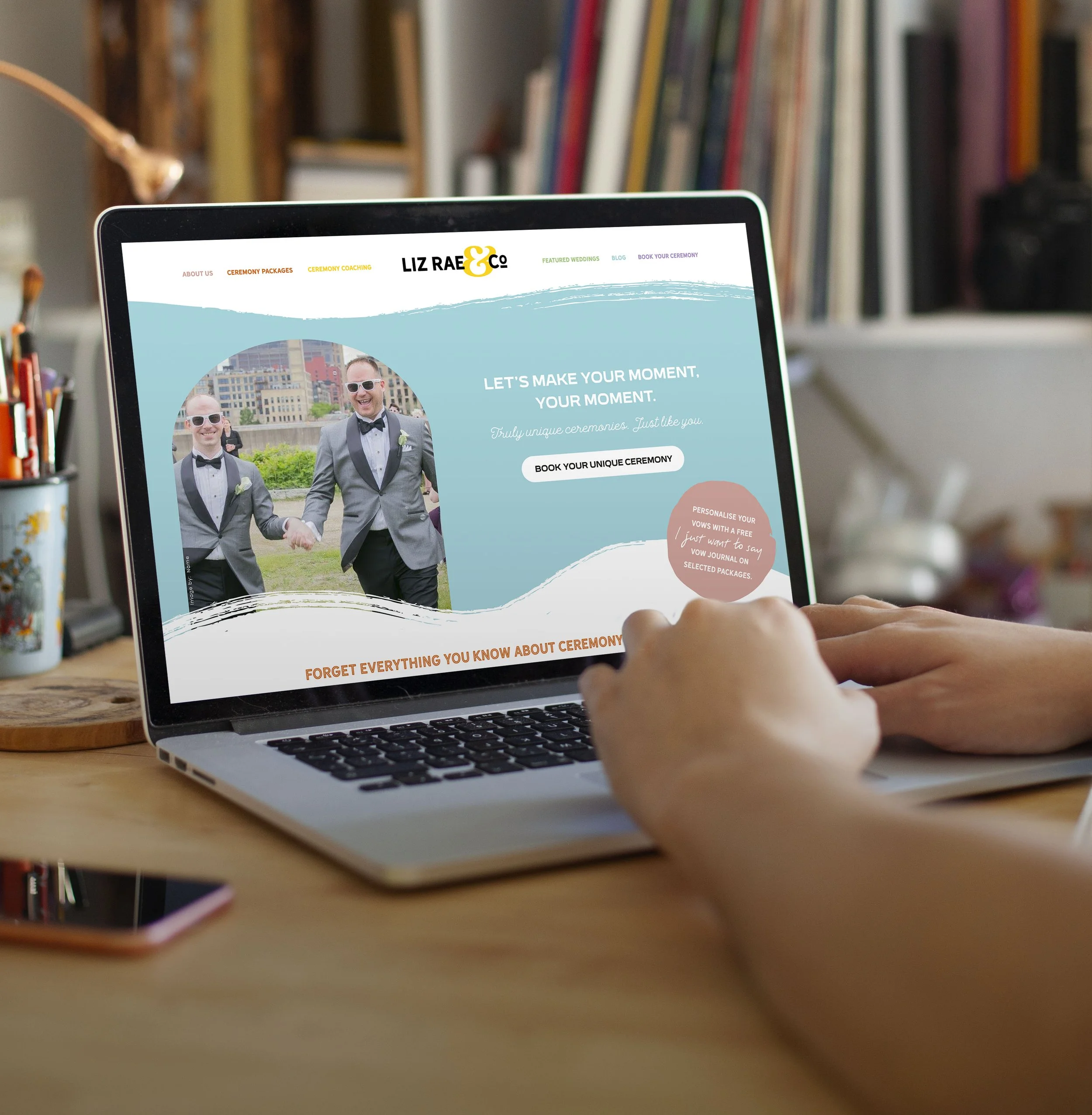
Colourful, illustrated website for wedding officiant, Liz Rae & Co – showing how strategic storytelling and clear design can improve engagement and conversion.
Spoiler: it’s not your CTA button colour. (Though we have opinions about Comic Sans.)
You don’t have a traffic problem. You have a clarity problem.
If people are landing on your site but not doing anything… that’s not a conversion issue. That’s a communication issue.
Here’s what we see all the time:
Founders with great businesses and confusing sites
Sites that look decent but say very little
CTAs that are clear – but the story leading up to them isn’t
And it’s not your fault. DIY branding, tight timelines, too many cooks – it all adds up.
But if you want your site to start pulling its weight, you need to start by asking: “Are we actually saying anything?”
Great websites don’t just look nice. They say something useful.
The real job of your site?
Make it clear what you do
Make it obvious who it’s for
Make it easy to act
If any of those are fuzzy, the rest doesn’t matter.
And by the way – “hero, features, testimonials, pricing, CTA” isn’t a strategy. It’s a template.
The real difference is in the message.
(We help founders clarify their messaging with Brand Strategy. The link is there if you need it.)
5 questions to stress-test your site content
Before you even think about redesigning, ask:
Can someone tell what we do in 10 seconds?
Is it obvious who we’re for (and not for)?
Are we solving a real problem – and naming it clearly?
Does our tone sound like us, or like everyone else?
What action are we actually asking people to take?
If you’re missing 2 or more – start there. Your site probably isn’t the issue. Your story is. And that’s completely normal – when you’re juggling product, team, and fundraising, it’s easy for your brand to become an afterthought.
Doesn’t mean it’s broken. Just means it might be time to tidy things up so your message can actually land.
But design does matter. Here’s why.
Even the sharpest story won’t work if it’s buried in noise.
If your design is:
Overcomplicated
Templatey
98% text, no rhythm or flow
…people bounce. Not because they’re bored, but because it feels like work.
Good design makes your message easier to absorb. Good UX makes action easier to take. Good visual identity makes you easier to trust.
You don’t need “fancy.” You need focus.
So what should you do?
Look at your site the way a cold prospect would.
Ask:
Can they get it without a demo?
Do they feel the value?
Is it easy to take the next step?
If the answer’s no, it’s time for a refresh. That doesn’t mean burn it down. It means rethink the story, sharpen the message, and redesign just enough to let it breathe.
Want help making your site actually work?
We work with founders who’ve outgrown their first site and want something clearer, sharper, and more grown-up.
Want a second pair of eyes on it? We’re always up for decoding a tricky homepage.